
Your brand,
made tangible.
The brand system for JS Designs — an Aurora, Ontario design studio serving Toronto and the GTA. Bold, modern, and built to last: ink, lime, and Space Grotesk.
Who We Are
JS Designs is an Aurora, Ontario design studio serving Toronto and the GTA. For twenty years we’ve designed and built the way businesses are seen — brand identity, signage, custom graphics, vehicle wraps, and AODA-compliant web. Design and fabrication under one roof.
CRAFTED
We don’t just design it — we build it. The right materials, the right finish, the right install.
MODERN
Bold, current, and unafraid. Design done properly, made to hold up.
PROVEN
Twenty years and trusted by names you know — RBC, Shopify, Starbucks, Tim Hortons, Canadian Tire.
For businesses that want to be seen properly, JS Designs is the Aurora studio that designs and builds brand, signage, and graphics as one system — twenty years of ideas made tangible.
The Logo Suite
The JS Designs mark is a clean, confident wordmark built for signage, screens, and everything between. There are three official lockups and a standalone icon. Always pick the version that matches the background so it stays legible.
Full Lockups

Primary — On Light. Dark logo. Use on white and light backgrounds.
Primary — On Dark. Light logo. Use on ink, black, and photo backgrounds.

Horizontal Lockup. Icon + wordmark side by side, for tight horizontal spaces like headers and email signatures.
Icon Marks

Icon. The two-square mark alone — for avatars, favicons, and tight spaces. Reads on light, dark, or accent backgrounds.
JS DesignsIcon in use. The mark works as a social avatar and a browser favicon.
The wordmark is set in Space Grotesk 700 — the studio’s display typeface.
Clear space & minimum size
Keep clear space of at least the height of the icon’s square on all sides. Minimum size: 32 px tall on screen / 12 mm in print so the wordmark stays crisp. Below that, switch to the Icon version.
Do’s & Don’ts
Palette
The full JS Designs palette — core brand colors plus the neutrals that keep the system flexible across every application.
Ink and Lime lead on a dark base, with neutrals for surfaces and body text. Never set pure lime as text on a light surface — use Lime Deep.
Type System
A confident display face paired with a clean, highly legible body face. Both are self-hosted, so the guide — and the site — never phones home for fonts.
one system.
Headlines, hero statements, section titles. Use sparingly and big.
Your brand, made tangible.
Body copy, captions, and UI. Set at a comfortable 16–18px with generous line height. The quick brown fox jumps over the lazy dog. 1234567890.
Weights: Inter 400–700; Space Grotesk 700 for display.
How We Show the Work
MADE TO BE SEEN.
Direction
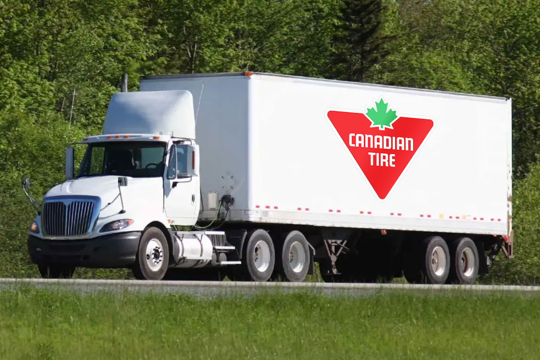
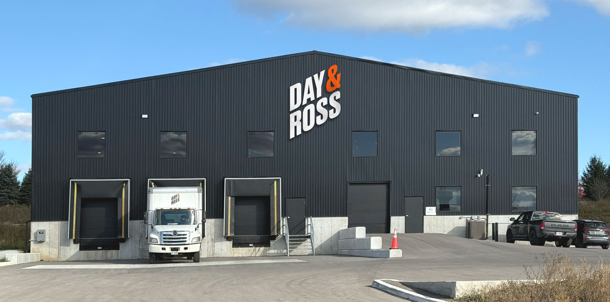
- Real installs, real places. Show the finished piece in context — on the wall, on the truck, above the door.
- Sharp and true. Clean light, accurate color, crisp edges — the craft has to read.
- Let the work fill the frame. Tight crops on signage and graphics; the product is the hero.
- Brand pops. Watch for the lime — as an accent, a highlight, a frame.
Avoid: cluttered backgrounds, heavy filters, or renders passed off as photos.
How We Talk
“WE LISTEN FIRST.
DESIGN SECOND.”
Personality
Confident · plain-spoken · craft-proud · a little dry. Never buzzwordy, never boastful.
We say
We don’t say
From the idea to the install.
Twenty years of ideas made tangible.
Applications
The system at work — buttons, cards, a badge, a website hero, and a social template.
Buttons & badge
DESIGNS20 YEARS
Website hero
Content cards
Storefront & Retail
Illuminated and dimensional signage built to spec and installed right.
Fleet & Vehicle Graphics
Full and partial wraps that turn the fleet into a moving billboard.
Identity Systems
Brand identity carried consistently from logo to storefront to truck.
Social template
New InstallBE SEEN.
On SiteBUILT.