TLA Graphics · Toronto, Canada Brand Guidelines · v1.0 · 06.2026

Bold surfaces.
Elegant systems.
Built to the millimetre.

Identity · Colour · Type · Devices · Imagery · Digital Constructed on a 60° lattice
  1. 01Brand foundation
  2. 02Logo system
  3. 03Colour
  4. 04Typography
  5. 05Graphic devices
  6. 06Photography
  7. 07Digital application
  8. 08Design tokens
  9. 09LUCY — product brand

Brand foundation

01 / Foundation

TLA Graphics turns brands into physical environments — signage, wraps, wall graphics and dimensional displays for names like Nike, Canada Goose and LG. The brand voice matches the work: confident enough to go big, refined enough for a flagship retail floor, and exact enough to trust with an eleven-storey install.

Bold

We make the largest object in the room. Layouts commit: oversized display type, full-bleed photography, decisive blocks of ink and teal. Nothing timid, nothing cluttered.

Elegant

Restraint is the luxury. Generous whitespace, a disciplined palette, hairline rules. One accent at a time — the work is the hero, the brand is the frame.

Technically precise

Every diagonal in our mark sits on an exact 60° angle — and everything else follows that discipline. Measured spacing, spec-style labels, tolerances stated, promises kept.

Voice

We sayWe don't say
"Installed overnight. Open by morning.""We offer a wide range of high-quality signage solutions."
"3M-certified installers. 0.5 mm tolerance.""Our team is passionate about excellence."
"From file to facade.""One-stop shop for all your printing needs."

Colour

03 / Colour

The heritage teal stays — it's on the building and on a decade of work. What changes is the ground it stands on: deep ink and warm paper replace flat white and grey, and a single shot of Lucy Yellow replaces the old material yellow. Ratio discipline is what makes it elegant.

Core
InkHEX #0C1516
RGB 12 21 22
Dominant dark · text on light
Core
PaperHEX #F6F5F1
RGB 246 245 241
Dominant light ground
Brand
TLA TealHEX #00A19B
RGB 0 161 155
Logo, large display, graphics
Accent
Lucy YellowHEX #FFD400
RGB 255 212 0
Always present · ≤5% · see 09
Brand
Teal 700HEX #007571
RGB 0 117 113
Links & teal text on light
Brand
Teal 300HEX #3FC9C2
RGB 63 201 194
Teal accents on ink
Brand
Teal 900HEX #073B39
RGB 7 59 57
Deep panels & blades
Neutrals
Neutral ramp#E7E9E8 · #C7CCCB
#97A09F · #5C6867
Rules, captions, secondary text

Ratio — 60 / 25 / 10 / 5

Paper leads. Ink anchors. Teal identifies. Lucy Yellow is always present, used sparingly — a marker, a highlighted word, an active state — as needed, not strictly counted. If yellow is everywhere, it is nowhere.

Paper 60
Ink 25
10
5

Accessible pairings

TLA Teal fails AA for body text on light grounds (2.9:1) — reserve it for display sizes and graphics; use Teal 700 for teal text and links.

Ink on Paper 17.2 : 1 · AAA
Lucy Yellow on Ink 12.6 : 1 · AAA
Teal 300 on Ink 8.9 : 1 · AAA
Teal 700 on White 4.9 : 1 · AA

Typography

04 / Type

One family, two voices — plus a shop-floor accent. Ancizar Sans does the talking: bold weights for headlines, regular and medium for reading. A humanist sans with nine weights and a 1,000+ glyph set, released open-source under the SIL OFL — a single family keeps the system elegant and the type unmistakably ours. IBM Plex Mono handles labels, specs and measurements. Both load free from Google Fonts.

Display · Ancizar Sans 600–700
Aa Gg Rr
1234

ABCDEFGHIJKLMNOPQRSTUVWXYZ abcdefghijklmnopqrstuvwxyz 0123456789 →

Body · Ancizar Sans 400–500
Aa Gg Rr
1234

ABCDEFGHIJKLMNOPQRSTUVWXYZ abcdefghijklmnopqrstuvwxyz 0123456789 @&?

Spec · IBM Plex Mono 400–500
Aa Gg Rr
60.0°

ABCDEFGHIJKLMNOPQRSTUVWXYZ 0123456789 ±0.5MM

Scale

Display · 96/1.0 · -3%
Large format.
H1 · 52/1.05 · -2%
Signage & environments
H2 · 32/1.15 · -1%
Vehicle wraps, measured twice
Body · 17/1.7
From concept to installation, we manage every step in-house — design, print, fabrication and a certified install team that treats a retail floor like a clean room.
Spec · 12/1.5 · +14% · Caps
Material: 3M IJ180 · Laminate: Matte · Tolerance ±0.5 mm

Graphic devices

05 / Devices

One geometry, used sparingly. Every device is derived from the mark's 60° construction — nothing decorative gets invented outside it.

The Blade — 60° cut panel

Panels and image edges are cut at 60° — the logo's own angle. Use one blade per composition, always carrying content (a headline, a caption), never as loose decoration.

Large format wall graphic behind a blade panel
Case study · Retail

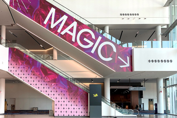
Escalator takeover,
installed overnight

Spec labels, index numbers & measured rules

Mono uppercase labels with a yellow triangle marker; two-digit index numbers on sections; hairlines with a 64 px Lucy Yellow tick. These carry the "technically precise" voice through every layout.

01 / Wall graphics
01 — Signage 02 — Wraps 03 — Environments 04 — Displays

Substrate: ACM 3mm · Finish: Matte · Install: 04.2026

Corner radius is 2 px everywhere — edges read as cut vinyl, not soft UI. The old 12 px radius is retired.

Photography

06 / Imagery

The work photographs itself — real installs, in place, at scale. Choose images with architecture, perspective and people for scale. Avoid flat product-on-white renders except in service listings. No filters, no duotones: colour accuracy is the product.

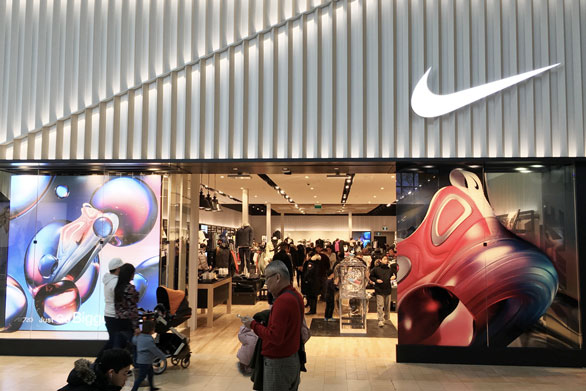
Nike storefront at Yorkdale with large printed window graphics
Hero · Scale + architectureIMG_7353-hd.jpg
Escalator wall graphic takeover
Hero · Environmentwallgraphics.jpg
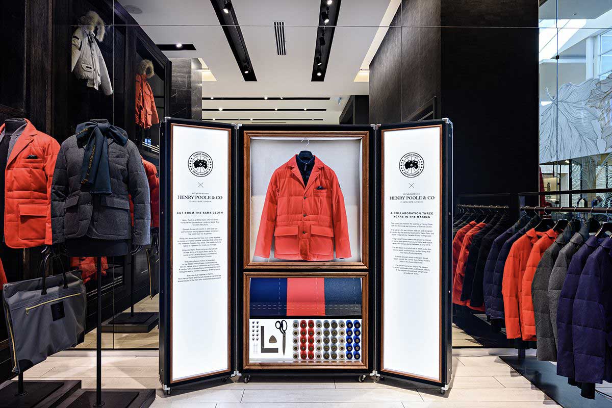
Canada Goose retail display case
Craft · Retail detailCanadaGoose-01.jpg
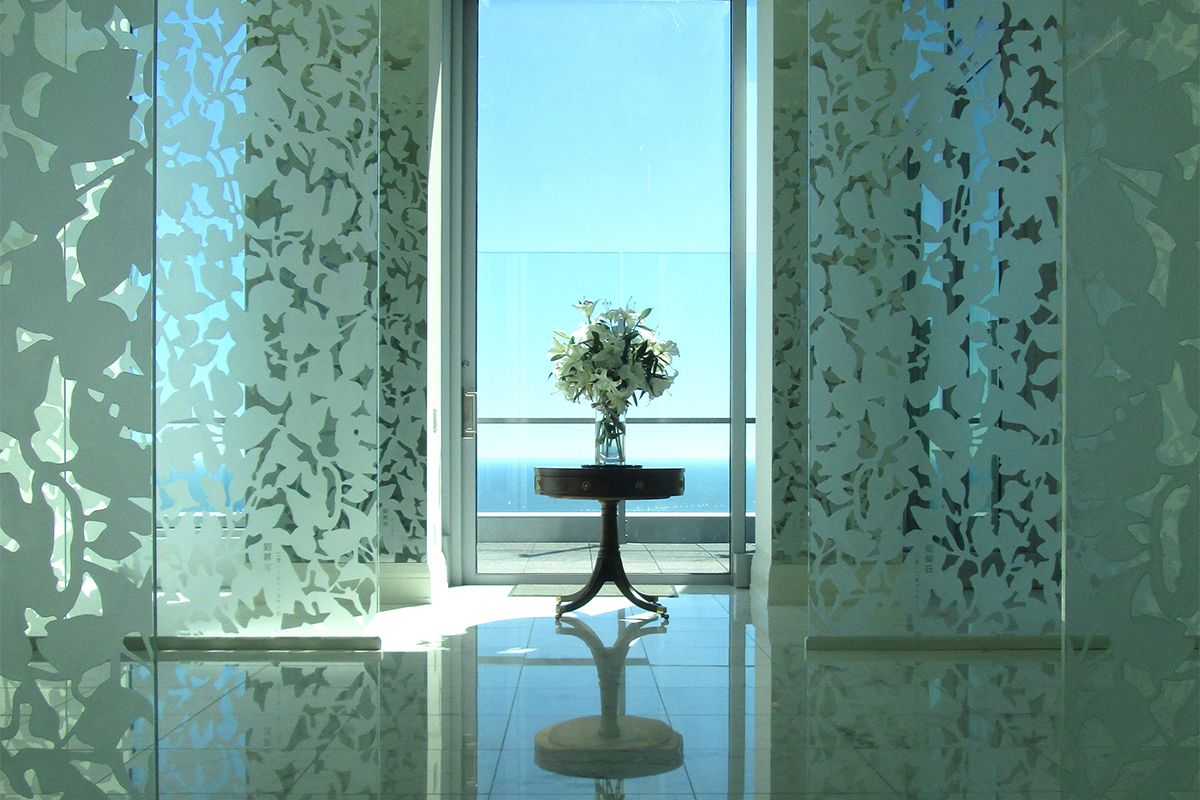
Frosted floral window film in a bright condo suite
Elegant · Light + materialIMG_2282.jpg
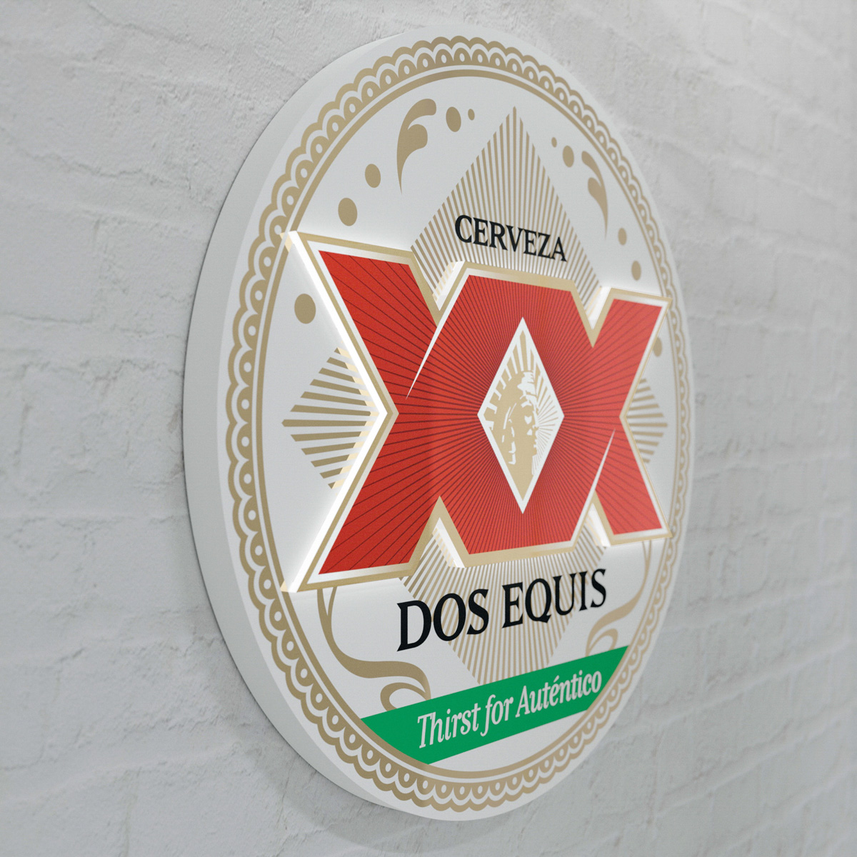
Dimensional Dos Equis wall sign
Craft · Dimensionaldosequis-04.jpg
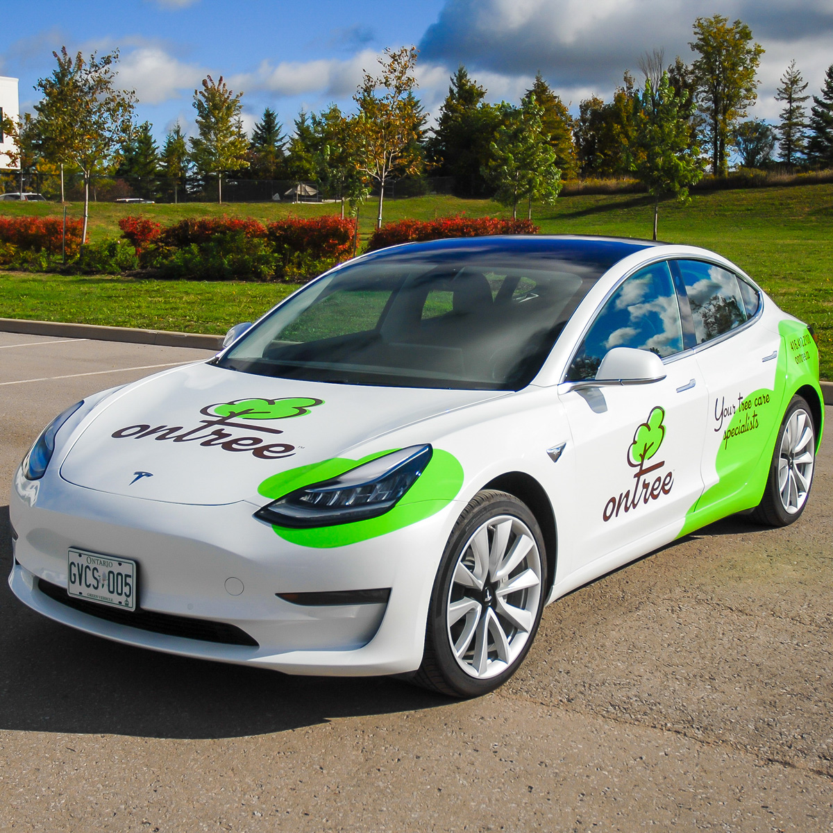
Ontree fleet vehicle wrap on a Tesla Model 3
Fleet · In the worldDSC_7362.jpg

Hero treatment

When type sits on photography: ink gradient scrim from the text corner (max 88% → 15%), Space Grotesk headline, mono spec label in Lucy Yellow. Never place text on an untreated image.

Nike Yorkdale storefront used as hero image with scrim and headline
Retail environments

Your brand,
at building scale.

Design, print, fabrication and certified installation — one team, one tolerance.

Digital application

07 / Digital

How the system lands on tlagraphics.ca: content max-width 1280 px, 12-column grid, 8 px spacing base, 2 px radii. Dark ink navigation and footer bracket paper-ground content.

Navigation

Buttons

Card

Canada Goose retail display
02 / Retail displays

Canada Goose × Henry Poole

Custom dimensional display casework for a flagship collaboration launch.

Design tokens

08 / Tokens

Drop-in replacement for the current :root in app/globals.css.

:root {
  /* colour — core */
  --ink-950: #0C1516;   --ink-900: #131F20;   --ink-700: #2A3839;
  --paper:   #F6F5F1;   --white:   #FFFFFF;

  /* colour — brand */
  --teal-300: #3FC9C2;  --teal-500: #00A19B;  --teal-700: #007571;  --teal-900: #073B39;
  --signal:   #FFD400;  /* sparingly, always present */

  /* colour — neutrals */
  --n-200: #E7E9E8;  --n-300: #C7CCCB;  --n-500: #97A09F;  --n-700: #5C6867;

  /* type — Google Fonts via next/font */
  --font-display: "Ancizar Sans", system-ui, sans-serif;  /* 600–700 */
  --font-body:    "Ancizar Sans", system-ui, sans-serif;  /* 400–500 */
  --font-mono:    "IBM Plex Mono", ui-monospace, monospace;

  /* geometry — 8px base, cut-vinyl edges */
  --radius: 2px;  --max-width: 1280px;  --cut: 60deg;
}

LUCY — product brand

09 / LUCY

LUCY is TLA's internally developed production-management platform — "Lucy runs TLA." The mark is the TLA icon with its L lit in Lucy Yellow #FFD400 — Lucy at the centre of everything TLA makes. In her memory, the accent follows one rule: sparingly, but always present — use it as needed, not strictly counted, and never absent. In LUCY the mark itself usually fills that role.

Lucy mark, ink with yellow L, on white
Primary · On lightlucy-icon.svg
Lucy mark, all Lucy Yellow, on ink
On ink · Altlucy-icon-alt.svg
Lucy mark, all Lucy Yellow, on deep teal
On Teal 900 · Altlucy-icon-alt.svg

Lockup

Icon at ~1.5× cap height, gap ~0.75× cap height. Wordmark in Ancizar Sans 700, all caps, −0.01em. Tagline as a spec label — Lucy Yellow on dark, Teal 700 on light.

LUCY
Lucy runs TLA.

Rules

Construction

The Lucy mark is the TLA icon with the L lit in Lucy Yellow — same 60° lattice, same geometry. Never redraw, rotate or restyle it.

Colour

Two files, fixed roles: lucy-icon.svg (ink mark, yellow L) on light grounds; lucy-icon-alt.svg (all Lucy Yellow) on ink or Teal 900. Never outlined, never recoloured.

Size & space

Minimum 24 px wide. Clearspace: half the mark's width on all sides. App icon: mark at ~62% width, centred on an Ink 950 tile.

Presence

Sparingly but always present — use Lucy Yellow as needed, not strictly counted. The mark usually carries it; loading states, empty states and the sign-in mark are its natural in-app roles.