SWIM
PROUD.
PROUD.
🦆 @AURORAMASTERDUCKS
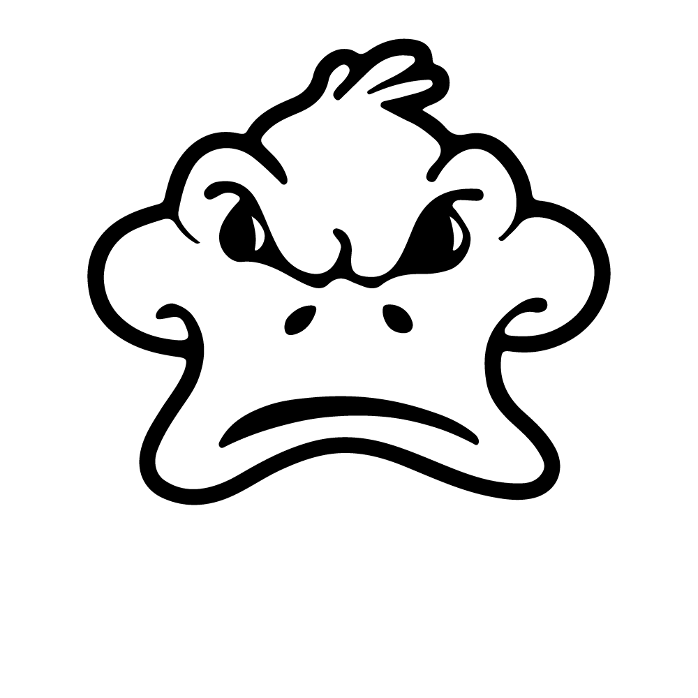
The brand system for the Aurora Masterducks — a Masters swim club with a competitive edge and an open door. This is a living guide: flip the concept toggle above to compare two complete directions.
Concept A — Bold & EnergeticAurora Masterducks is a Masters swim club in Aurora, Ontario — adult swimmers chasing personal bests, fitness, and camaraderie in equal measure. Fierce in the water, friendly on the deck.
We train hard and race proud — from local meets to Masters Worlds. The duck means business.
Every lane, every level. Returning athletes, fitness swimmers, and first-timers all belong here.
A tough little duck with a wink. We take the swimming seriously — never ourselves too seriously.
For adult swimmers who want more than a workout, Aurora Masterducks is the club where a competitive spirit and a genuine community share the same pool.
The Masterducks duck is the heart of the brand: bold, confident, unmistakable. There are six official assets — full lockups for headers and signage, and compact icon marks for tight spaces. Always pick the version that matches the background so the wordmark reads clearly.

Primary — On Light. Dark text. Use on white and light backgrounds.
Primary — On Dark. White text. Use on black, ink, and photo backgrounds.

Canadian / “Worlds”. Maple-leaf duck + wordmark, for national & international competition.
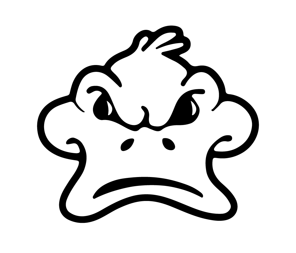
Icon. Duck head only — for avatars, favicons, caps, and tight spaces. Reads on light or dark.

Icon — Canadian. Maple-leaf duck head, no wordmark. The compact mark for competition & national pride.
 Aurora Masterducks
Icon in use. The mark works as a social avatar and a browser favicon — generated and included in assets/favicon/.
Keep clear space of at least the height of the duck’s eye on all sides. Minimum size: 40 px tall on screen / 15 mm in print so facial detail stays crisp. Below that, switch to the Icon version.
Colors sampled straight from the logo files. Core colors carry the brand; accents come from the pool — water blue and lane-rope red — for energy in photography and UI.
Concept A leads with Duck Yellow + Ink. Concept B leads with Maple Red + White, using Duck Yellow as the spark. Maintain WCAG AA contrast: never set yellow text on white — darken it or place it on ink.
A heavy, athletic display face for impact paired with a clean, highly legible body face. Both are free Google Fonts — easy to use across web, print, and social.
Headlines, hero statements, numbers. Uppercase. Tight leading. Use sparingly and big.
Every lane, every level.
Body copy, captions, and UI. Set at a comfortable 16–18px with generous line height. The quick brown fox jumps over the lazy duck. 1234567890.
Weights: 400 / 500 / 600 / 700 / 800.
Real swimmers, real effort, real water. Get close, catch the spray, and let the motion carry the frame. Authentic beats staged every time.
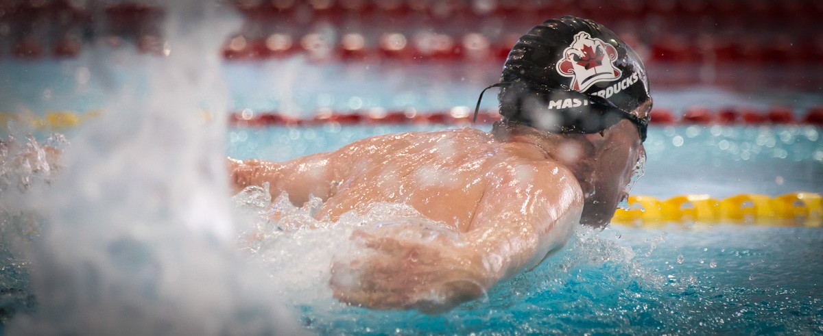
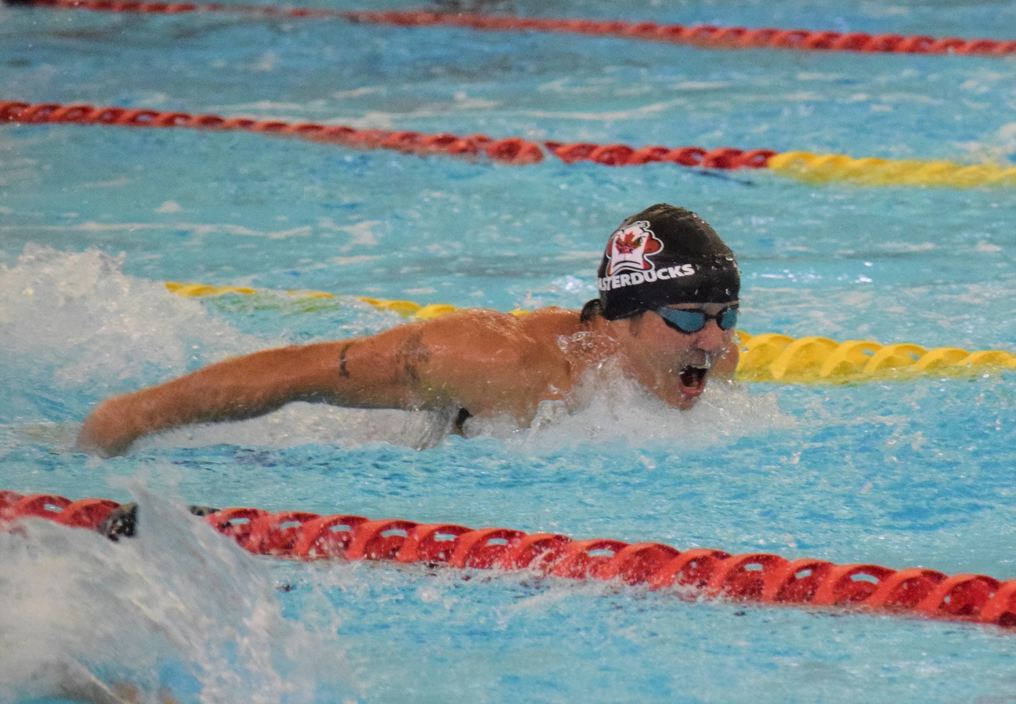
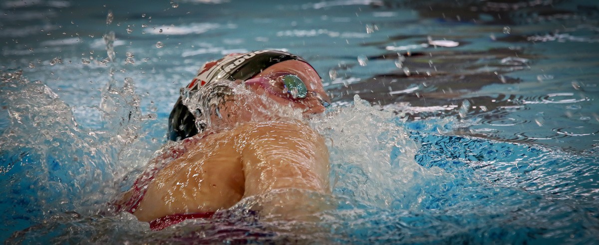
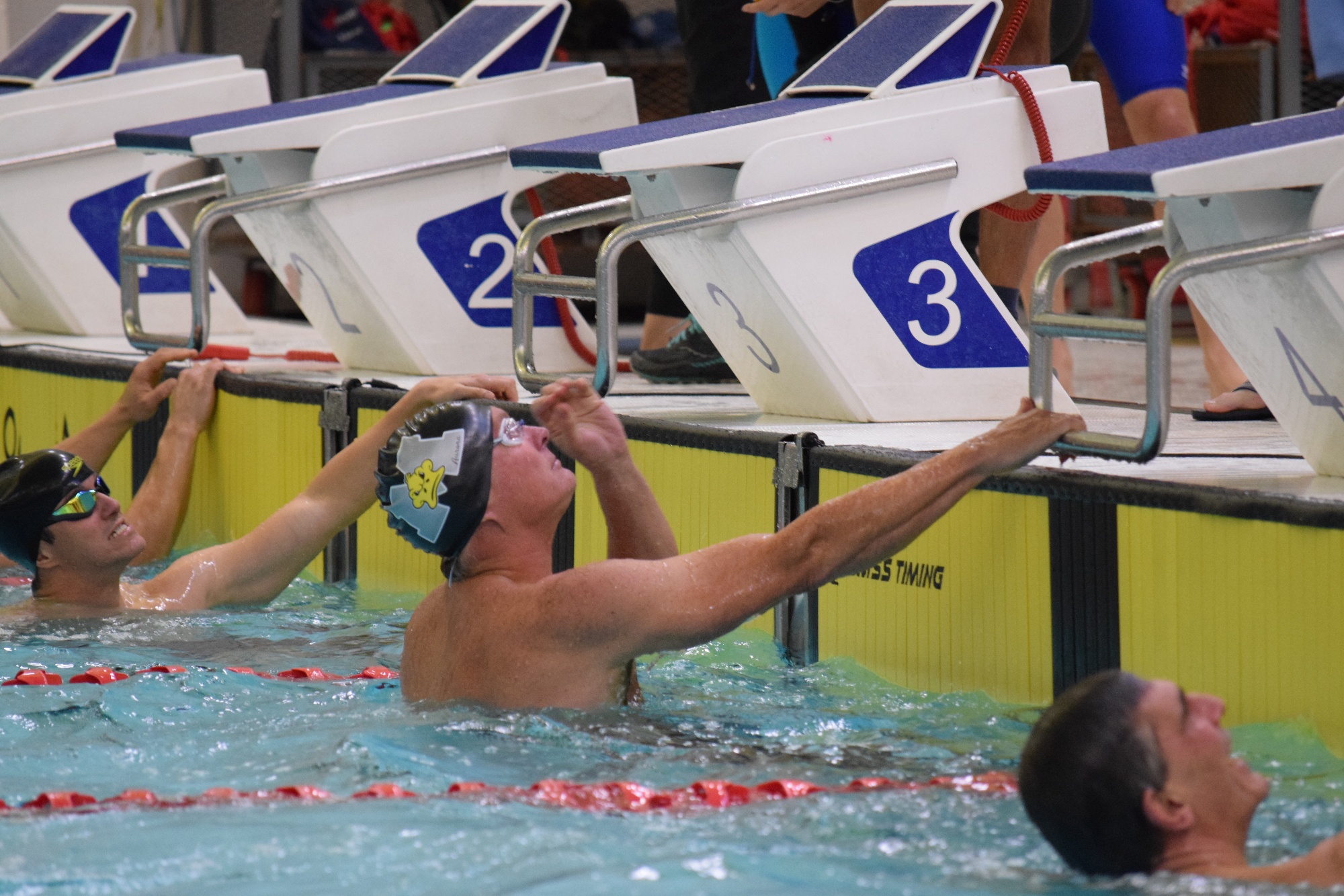
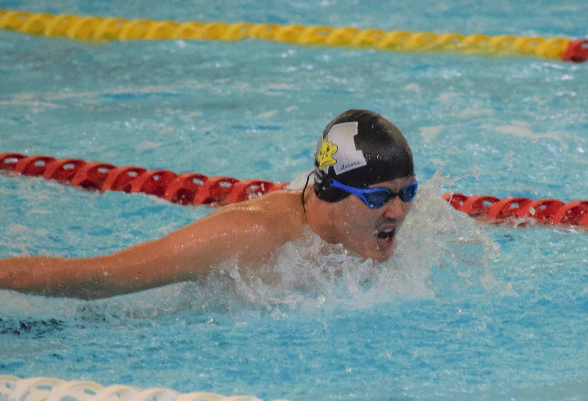
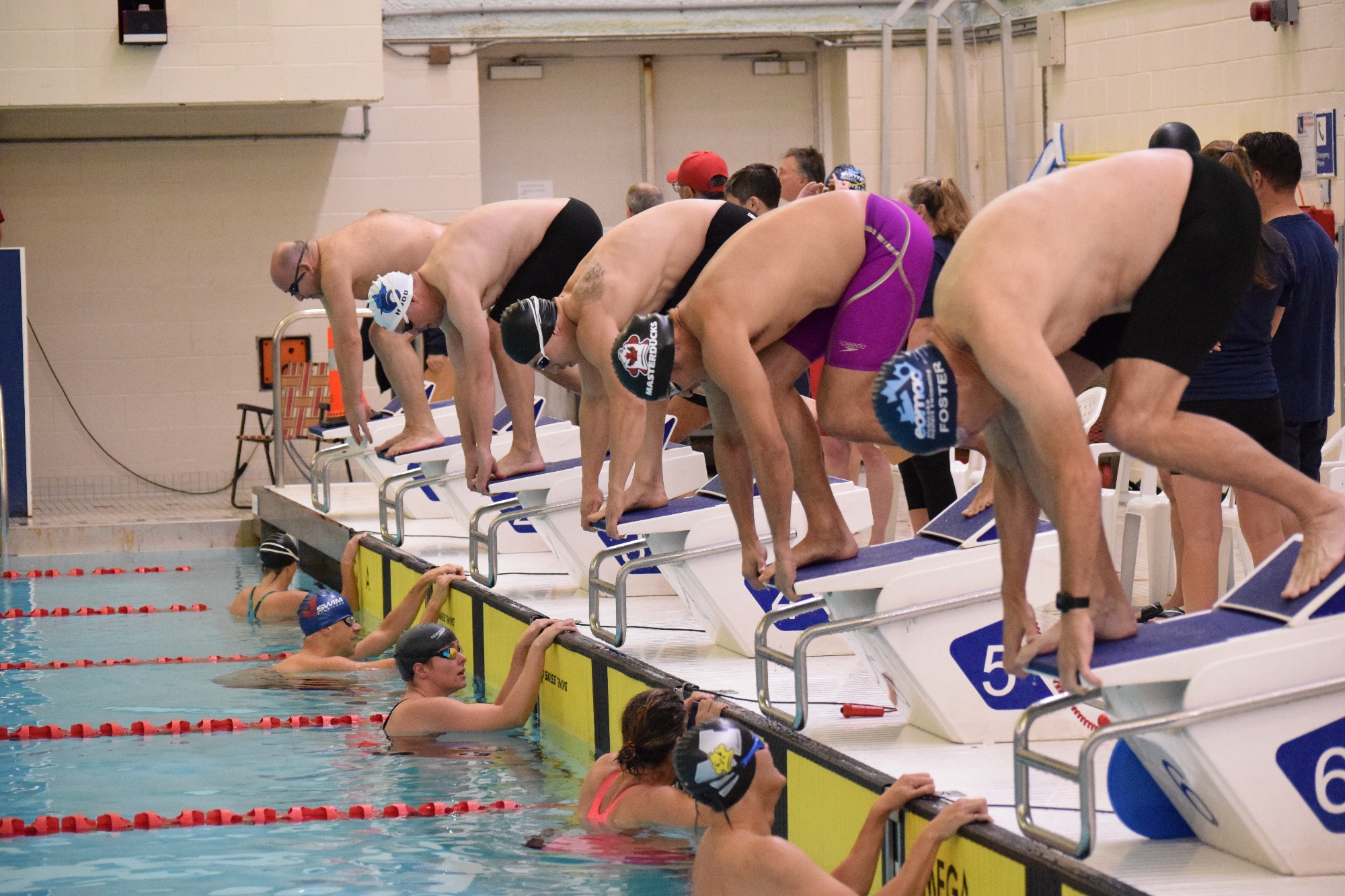
Avoid: flat posed line-ups, heavy filters, or stocky “fitness model” imagery.
Confident, warm, and a little cheeky. We speak like a teammate on the next block — encouraging the racer and the first-timer in the same breath.
“TRAIN LIKE A DUCK.
RACE LIKE IT MEANS SOMETHING.”
Spirited · inclusive · proud · playful. Never boastful, never intimidating.
Chase the wall. Chase the clock. Chase the podium.
You don’t have to be fast. You just have to show up.
The system at work — buttons, cards, badges, a website hero, and a social template. Everything below re-themes live with the concept toggle.
Coached sets for every level, six mornings a week.
Race with the flock — from local meets to the world stage.
Coffee, socials, and a lane-mate who has your back.
Race Day
Join Us